Making the Most Out of the Text Tool in Pixlr/Using Layer StylesBy cherrystarluv
In this tutorial I will show you how to spruce up your text with effects! Adding effects to your text can add a whole new look to your signature. These methods can also be used on any png you'd like.
Photoshop has a similar function as well as pixlr.
1.) First, open your document to whatever size you want. Or you can just add it directly to the picture you want to add text to. I just opened a random sized transparent picture.
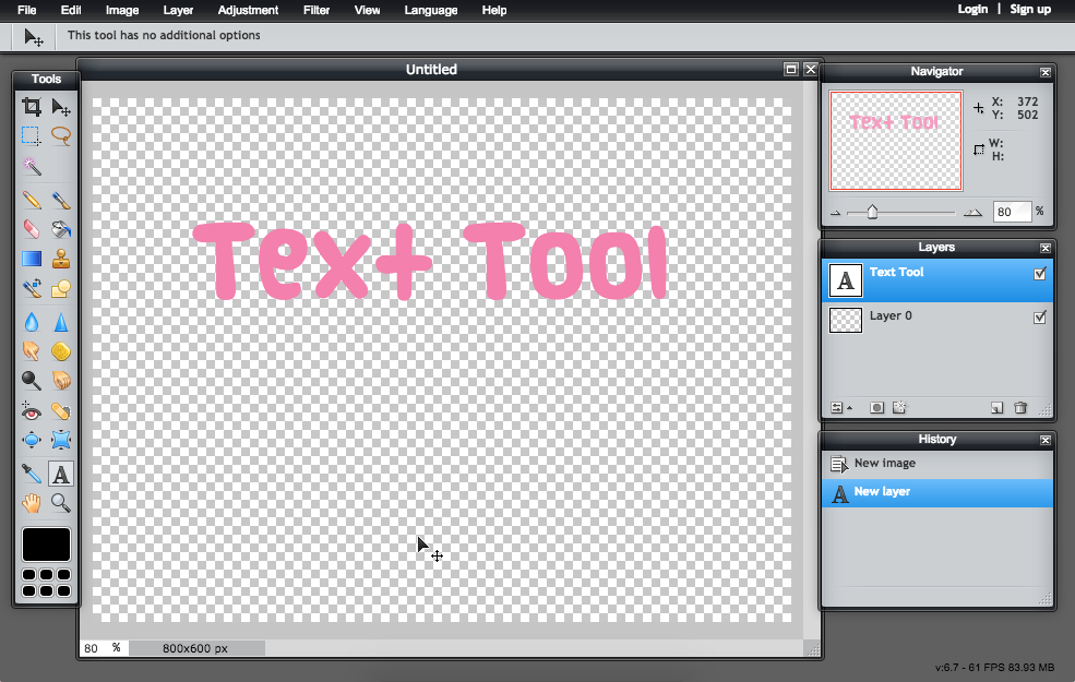
2.) Type your text, change the font, size, color, etc. of your text. Do whatever you like! Just saying, but some of the effects look better with
bolder fonts.
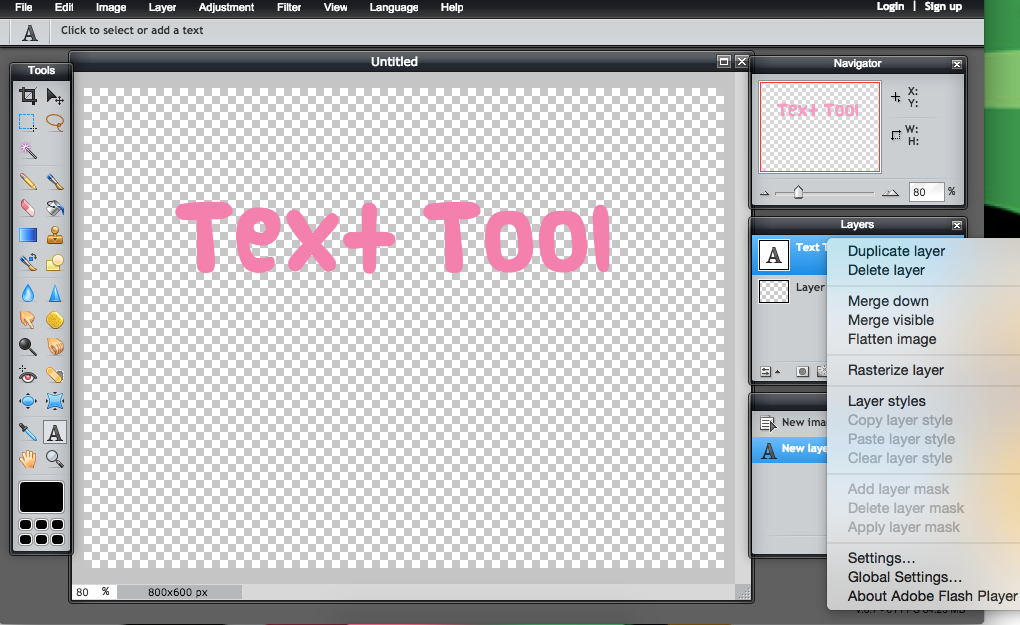
3.) Right click the text layer, and select the option "Layer Styles" which is underneath "rasterize layers" and there should be a bunch of greyed out options.
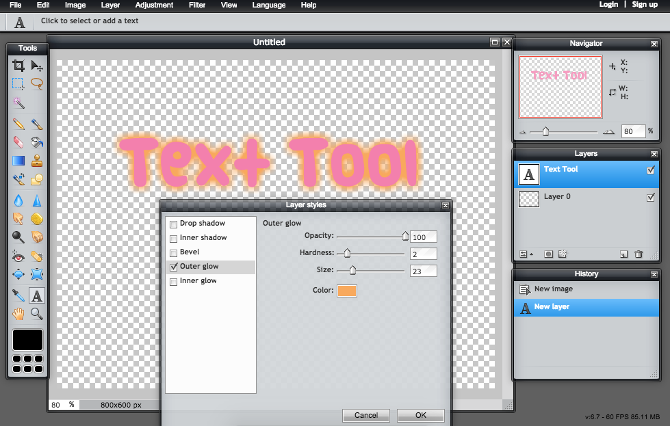
4.) There should be a bunch of options, which I will explain one by one. But all you need to know is you have to play around with the sliding settings. The first option I chose is "outer glow" it should look something like this. (make sure the little box is checked off) I will keep the settings of the style for learning purposes in case anyone would like to mimic the effect I made.
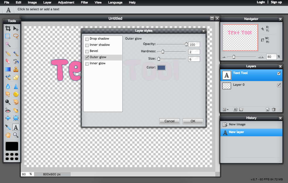
5a.) Outer glow adds a nice glowing effect to your text. You can make the glow bigger, harder, more translucent. You can even change the color to whatever you'd like!
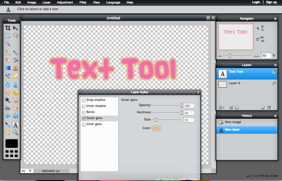
5b.) Another cool thing outer glow can do is make a smooth outline around the text! You've all seen this before! Now all you need to do is slide the "hardness" level all the way to 10. Then you can change the color or the size or whatever you'd like.
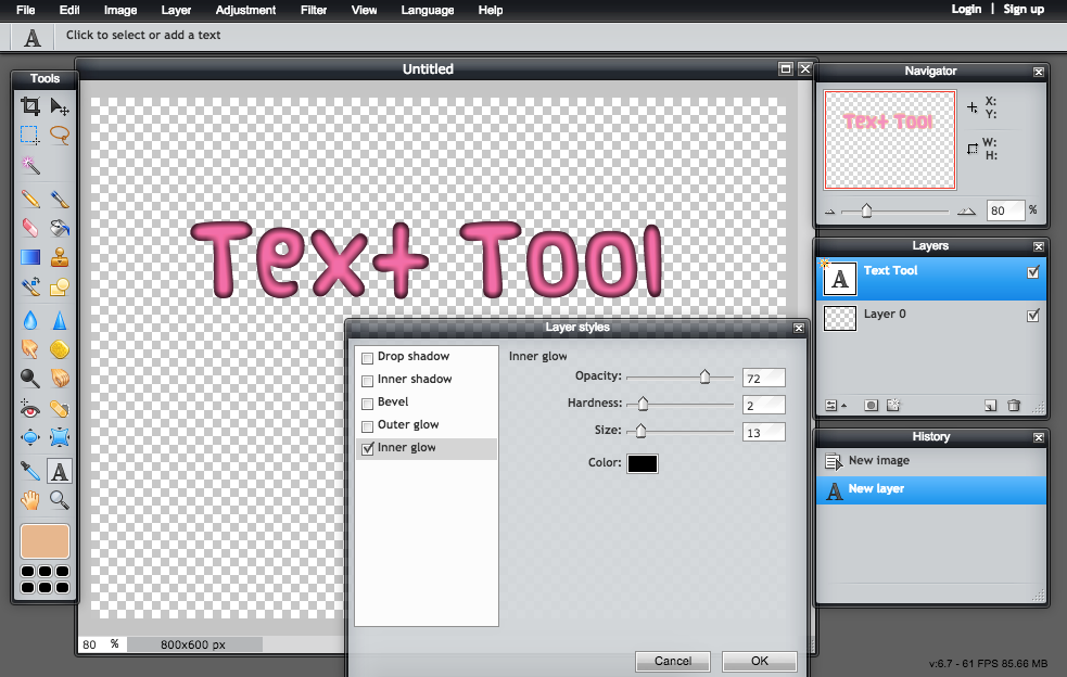
6.) This next style is called inner glow. It's similar to outer glow, except instead of making the text look like it's glowing, the effect is actually going inside the text. The effect looks nicest with thicker fonts. It has the same settings as the outer glow.
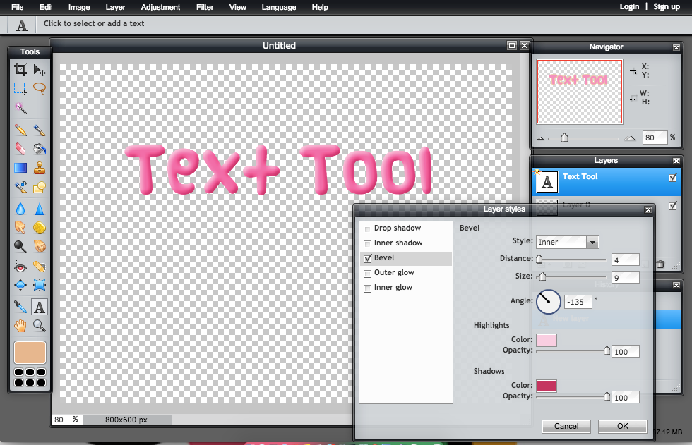
7.) The next effect is called Bevel. This makes your text look 3D and pop out of the image. It's actually pretty tricky at first trying to make it look right, but it's easy once you know what you're looking for. Personally, I don't change the angle or distance, but the styles of the bevel can be pretty neat. The inner (what I'm using) makes it look 3D or bubbly. The outer is kind of like a glow with 2 colors. The full combines the 2 and could look really cool in your signature. When I do the bevel effect, I always change the highlights color from white to a lighter version of the original text color. For the shadows option, I always change it to a slightly dark but more brighter/saturated version or the original text color. Looks best with thick fonts.
8.) Drop shadow is exactly what it sounds like: it adds a little shadow to your text. This is a great style, it's my favorite because it looks good on any text or png. You can go wrong with this one. It is a pretty subtle change but improves dramatically and adds a lot more dimension.You can change the distance and make it closer or further away, change the opacity, or change the size/blurryness of the shadow. You can also change the color but I do not recommend that because I think blacks looks the nicest but sometimes gray/dark gray looks good, too.
Warning: when cropping please keep in mind that some parts of the drop shadow and outer glow could be cut off and look strange. Be very carful with cropping and do not cut too close.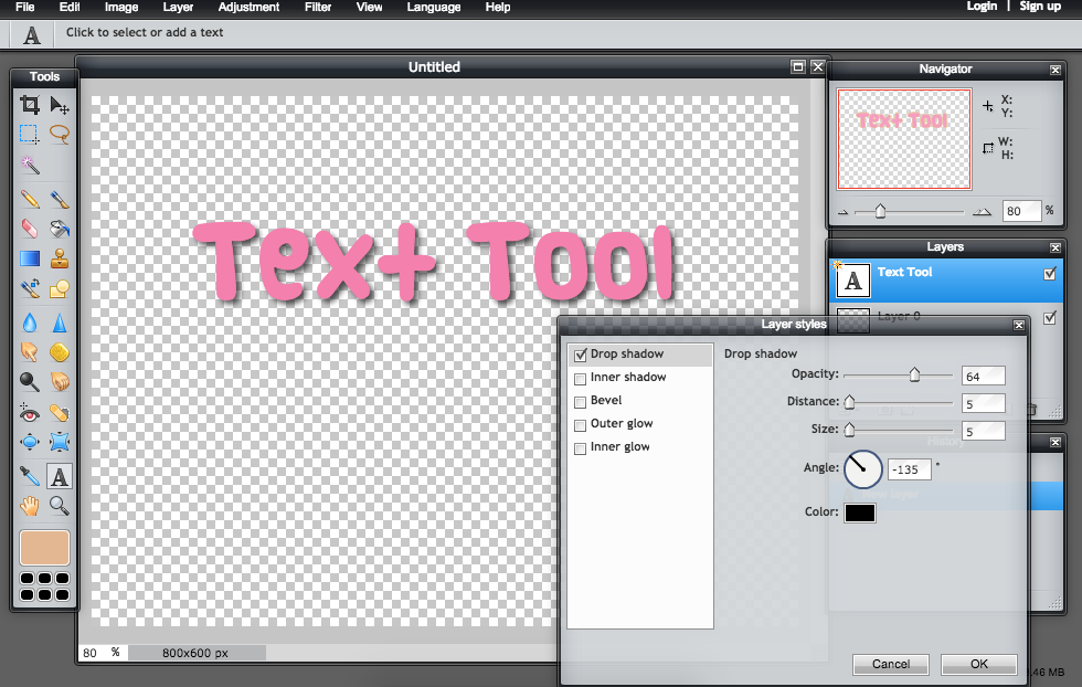
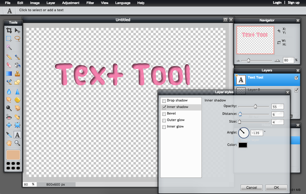
9.) Finally, Inner shadow. This is another style that looks best with thicker fonts. It adds a pretty neat effect where it kind of looks like the text is below the image. It has the same effects as the drop shadow.
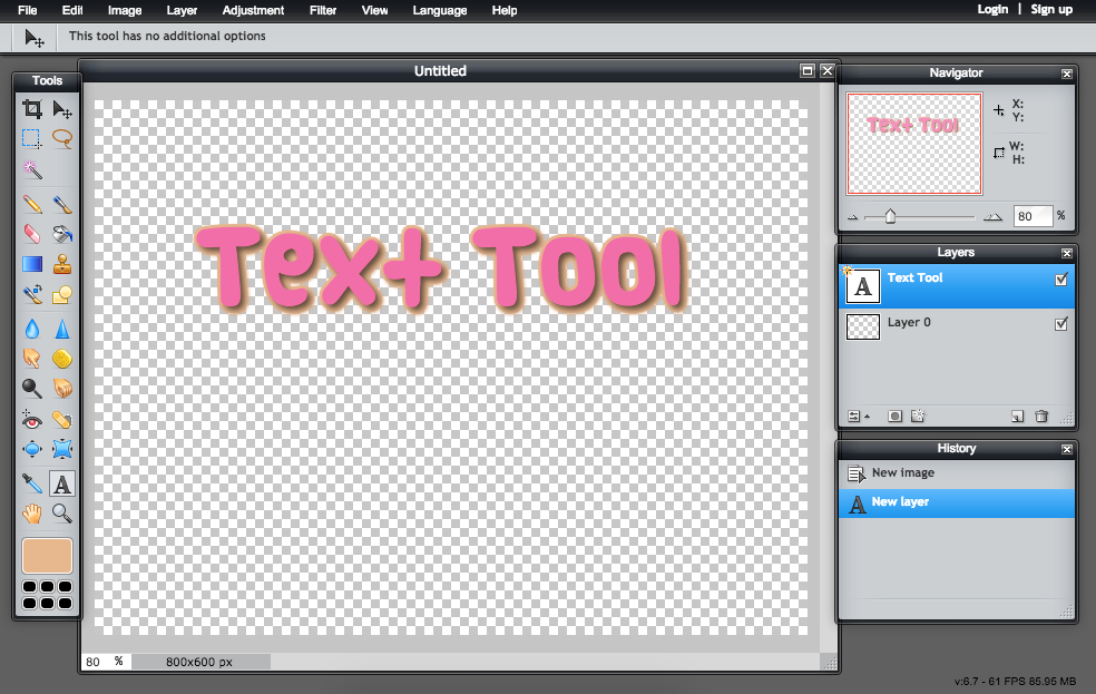
10.) Use multiple effects at the same time! Here's my favorite style combination, Outer glow on 10 Hardness and a drop shadow.
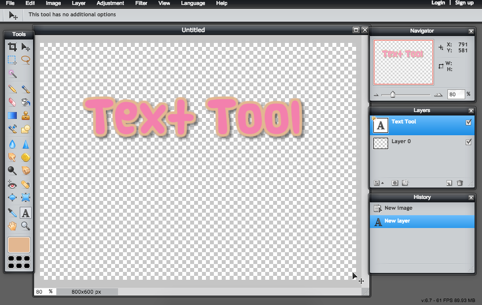
11.) The order you apply the effects is crucial!! In the picture above I did the outer glow and THEN the drop shadow. In the example below, I did the drop shadow and then the outer glow. It looks much different. This may be something you would be interested in but it's not what I'm looking for, so be aware of that when making your text. There are tons of different combinations.
Enjoy playing around with all the settings, it's not an exact science. Once you get the hang of it, everything will be so quick, so efficient and look so great!
I mentioned this before in this tutorial but all of these methods work on any type of png with a transparent background. Including word art from the internet or little pictures that were cut out. It's a neat little tool that can be used all the time. 
Here are some examples of me using the effects (don't steal, please):


